Yesterday, I wrote a blog post detailing how I crawled an entire MMORPG’s player database via their search page. Since then, I have been analyzing that data in Minitab and trying to gain some insight into the state of affairs of that game. Today, I’m going to attempt to explain some of that data using statistics and common sense. In particular, we’re going to find out if there’s a relationship between when players join the game *and *when they stop returning.
Preparation
I’m new to the statistics software package I’m using, Minitab, and I’m not aware of an easy way to take measurements based on dates. So, my first order of business was to convert dates in the database to an easier metric for analysis, “days since today,” which is simply today’s date minus date x. I did this in my database (MongoDB) prior to export by adding a “last_seen_days” attribute to all documents (records). This attribute is simply the difference between today’s date and the date that the player stopped logging in – measured in days. I then did the same for the signup date. This was quickly done in the MongoDB console in just a few lines:
> var today = new Date();
> var day = 60*60*24*1000;
> db.accounts.find().forEach(function (o) { o.last_seen_days = Math.ceil((today.getTime() - o.last_seen.getTime())/day); db.accounts.save(o); })
> db.accounts.find().forEach(function (o) { o.date_joined_days = Math.ceil((today.getTime() - o.date_joined.getTime())/day); db.accounts.save(o); })
The Scatterplot
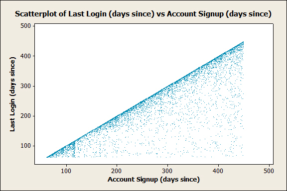
I then exported my data to CSV, loaded it in Minitab, and created a scatterplot between these two attributes. What I got was this:

For the uninitiated, a scatterplot **is a quick and easy way to visually see if there’s any type of relationship (correlation) between two variables. In this case, I used the signup date as my **independent variable (x) and the “last seen” date as my dependent variable (y). Overall, there is not *any real relationship between the signup date and the last seen date. However,* there are two significant items in this graph that deserve to have some attention brought to them.
Observations
The first and most obvious item is that there are not any points above the identity function. The identity function, or just f(x) = x, is the diagonal line directly across the center of the graph. This makes perfect sense since it’s impossible for a player to have their “last login” occur before they even sign up. I bring this up because this leads into my next observation:
There is a heavier concentration of data points plotted on or directly below the line of the identity function. For points exactly on the identity function, these are accounts that registered but were never logged into. For accounts *below *the identity function, these should be considered more significant to those who run the game. Why is that? Because, simply put, I believe that these accounts belong to players who went through the effort of joining; They signed up, validated their email address, logged in, and for whatever reason chose not to stick around. This is akin to the “bounce rate” so frequently mentioned in the context of web analytics.
It’s possible that these new players didn’t understand the interface and left, or maybe they thought the game play was too slow, or maybe… this list could go on. What’s important is that some attention is paid here. Some effort should be made to discover why these players are leaving and the number of these players (or almost-players) should be measured, monitored, and analyzed. Decreasing this metric (“bounce rate”) should be a regular goal as these players represent a potential revenue stream for the game’s owner as well as a potential contribution to the game for the rest of the players.
The Histogram
While, in this case, the scatterplot helped us see that there are a noticeable amount of players who quickly “bounce” after joining the game, this type of graph doesn’t make it particularly easy to measure the magnitude of this phenomena. From observing this behavior, we next want to know how many players are leaving, or what our “bounce rate” is. Instead of first trying to quantitatively define the bounce rate so that we can measure it, it’s probably best if we first take a look at the total distribution of how long players are active for before leaving. For this, we’ll use the histogram of “Days Active”. Days active is simply days since signup minus days since last login.Here’s what we’ve got:

In this histogram, I excluded the lowest rank from being included in the histogram. I did this because I was more interested in how many potentially-active players were leaving, as opposed to junk accounts. As such, our definition of the bounce rate is already becoming more different than the bounce rate in web analytics.
Each bin (“bar”) in our histogram is 15 days wide. Knowing this, you can see from the histogram that the largest density of days active seems to be about from 15 days to 2.5 months. This chunk, while significant, doesn’t have much to do with our bounce rate mentioned above. What we’re instead interested in is the near-5% of players who become inactive in less than a week.
What’s Next?
If this were my game (it’s not), I would work on defining what level of bounce rate is acceptable and set some goals based on that. I would then look into the large amount of players leaving within the first 2.5 months and try to increase player retention. Finally, I would automate these measurements and have them displaced in a nice administrative dashboard (I’ve always wanted one of those) so that I have to see them all the time.